Absolutely fabulous
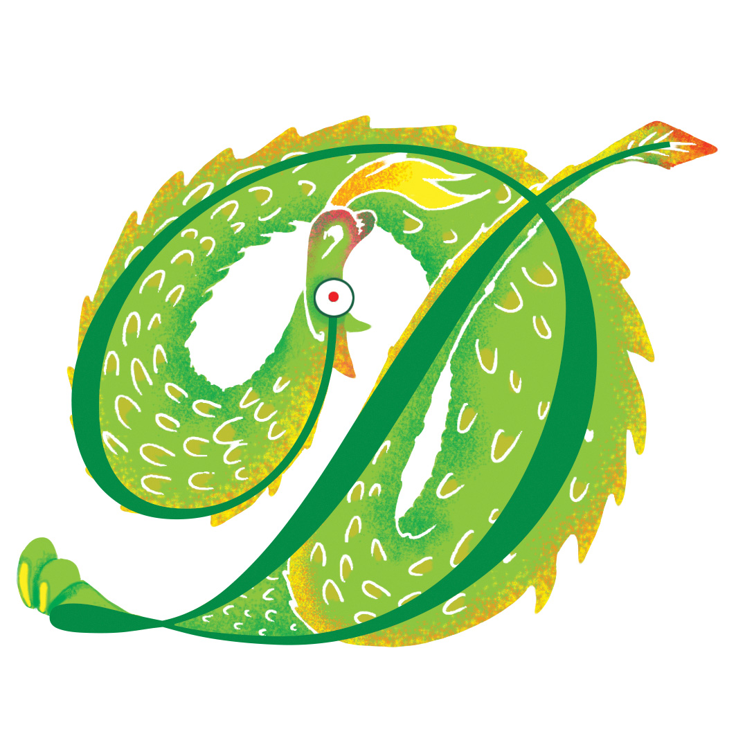
A is for absolutely fabulous! 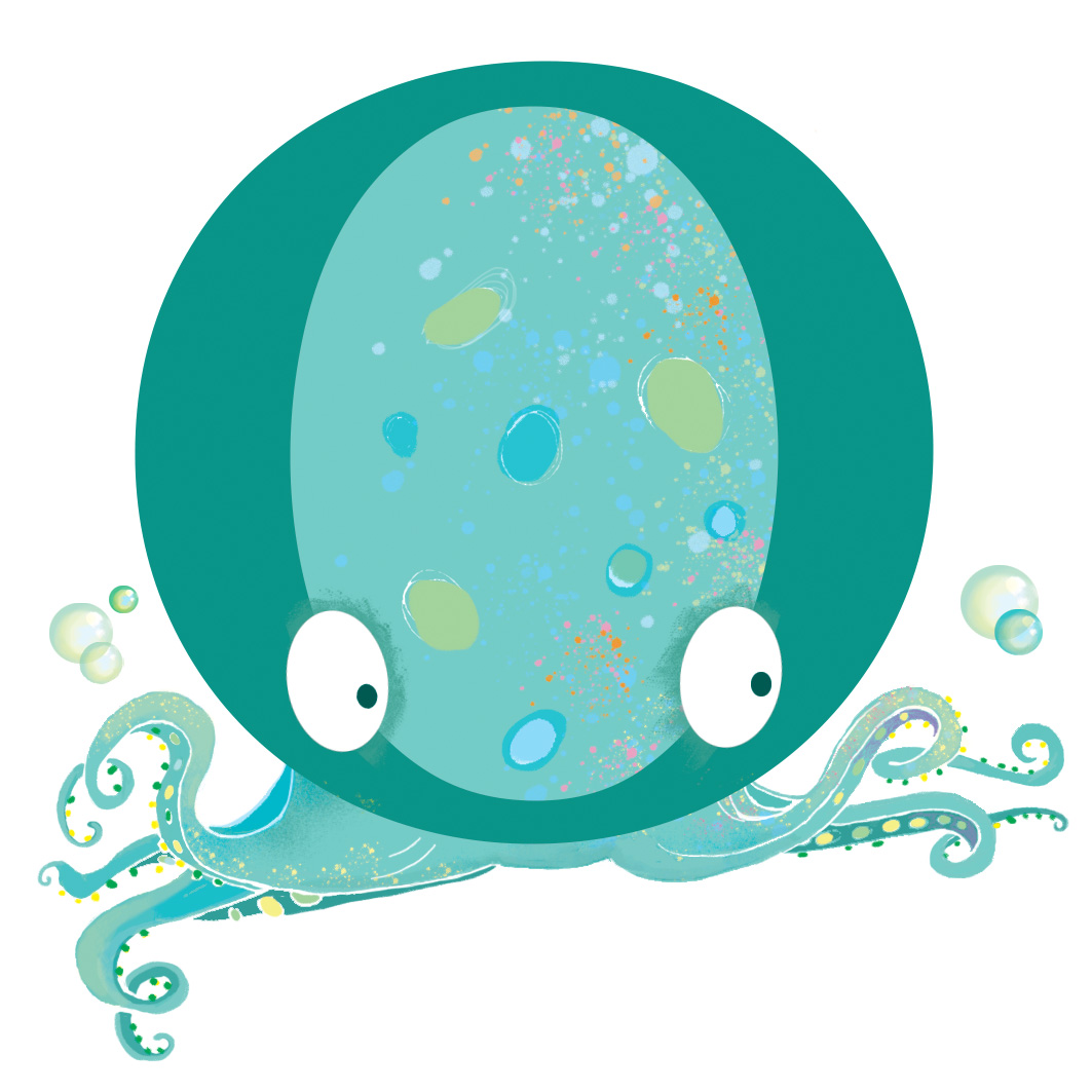
It really is for the absolutely fabulous alphabet book. These little spot illustrations were recently completed for an alphabet book with a difference. With a dash of Spike Milligan and liberally peppered with British humour throughout, this book was great fun to work on and I hope the writer won’t mind my saying that (looks around nervously). The book contains a series of whimsical, funny rhymes, inspired by letters of the alphabet. But these go further than your average ‘A is for Apple’ oh yes! There is A is for Arachnid, N is for neighbours, U is for Under and Q is for Queue. So you can quickly see how this alphabet book set me some challenges! As a result, it was great fun and very interesting for me to work on too! Who wants dull? No one, I hear you say!
Sketchy digital
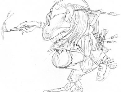
The initial sketches (visuals) were all hand-drawn and some of the finished artwork too, but almost all the colour work is digital. I chose not to go too splashy with paint on this project and quite graphic because the final artwork is small and you don’t really want very busy spot illustrations anyway. Less really is more at times.
Binoculars
Working digitally on such little illustrations does have another advantage. You don’t need binoculars or a magnifying glass to see what you’re doing! You can just zoom in and pick out really teeny-tiny areas of artwork. So after much zipping about on my Mac screen I had a contended client, who will happily come back to me with future projects, which sounds a little boastful I know, but it all went so well.
I wasn’t sure where to place these spots in my folio, because they aren’t really characters I have designed or illustrations for a narrative and so I have decided, for now, to give them there own spot illustration folio, and so please click here if you’d like to see more – and a few other spots (not nasty red blotchy things of course)!